


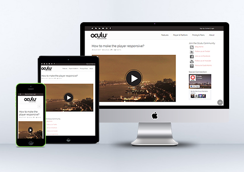
How to make the Player Responsive
Here’s how the process works.
Let’s get started. First things first… upload a video!
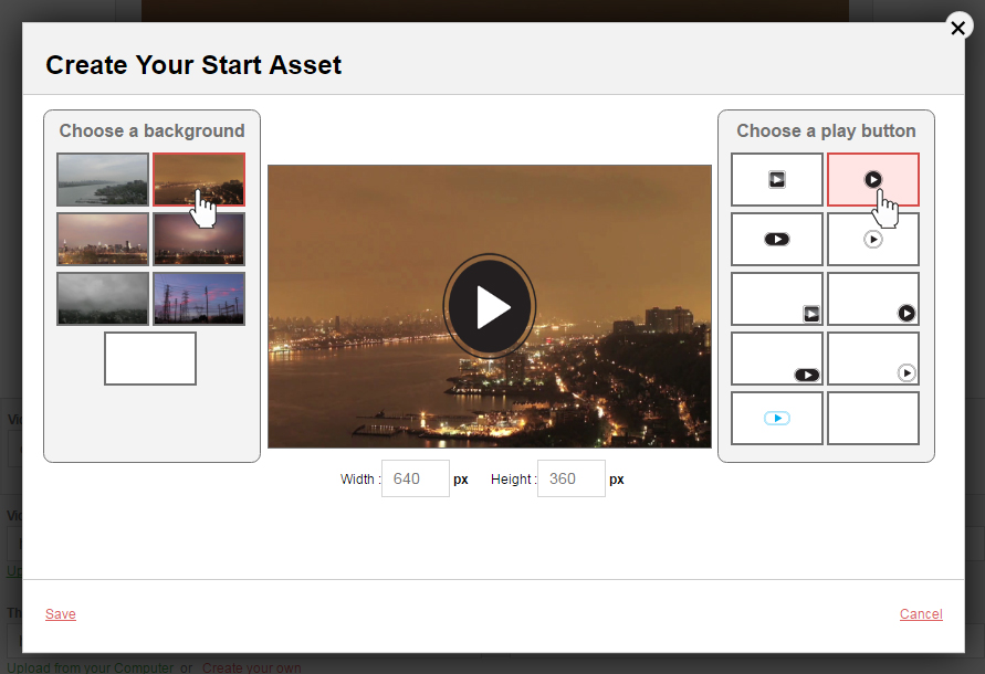
Go to the video dashboard, choose the desire video title, then go to “Start Asset” Select, “Create Your Own.” Choose desire frames and click “save”.
Video Tab
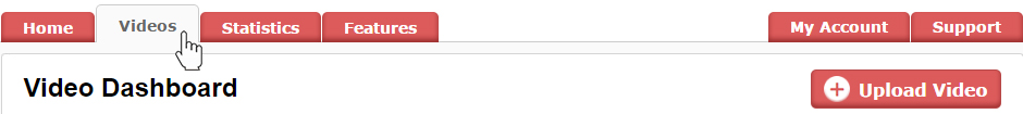
Click on Video Title

Video Start Asset
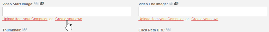
Create Your Start Asset
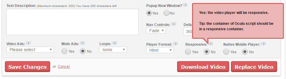
Under the video player see the responsive setting – you can choose options either “Yes or No”.
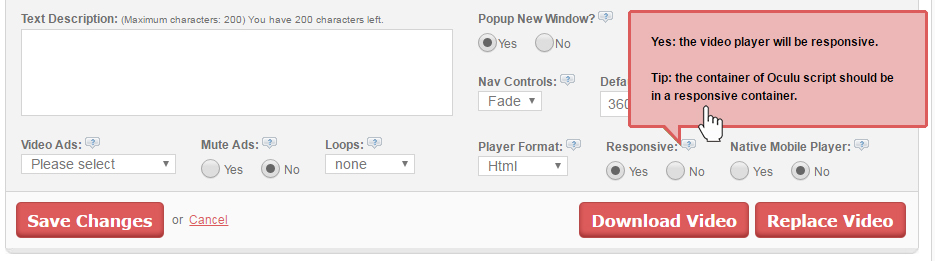
If you select “Yes” the video player will become responsive and will adapt to any screen size automatically. Then click on Save Changes button to save the changes.
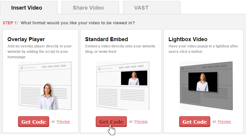
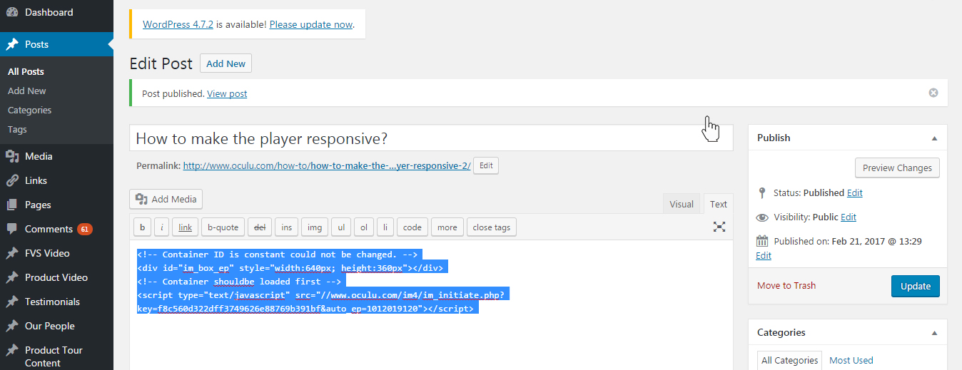
Then scroll down to Insert video and get the standard embed code, copy the load script, insert it into your web page.
Video Format
Copy the Standard Embed script
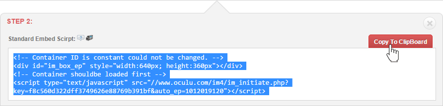
Paste the Standard Embed script on your WordPress page or post
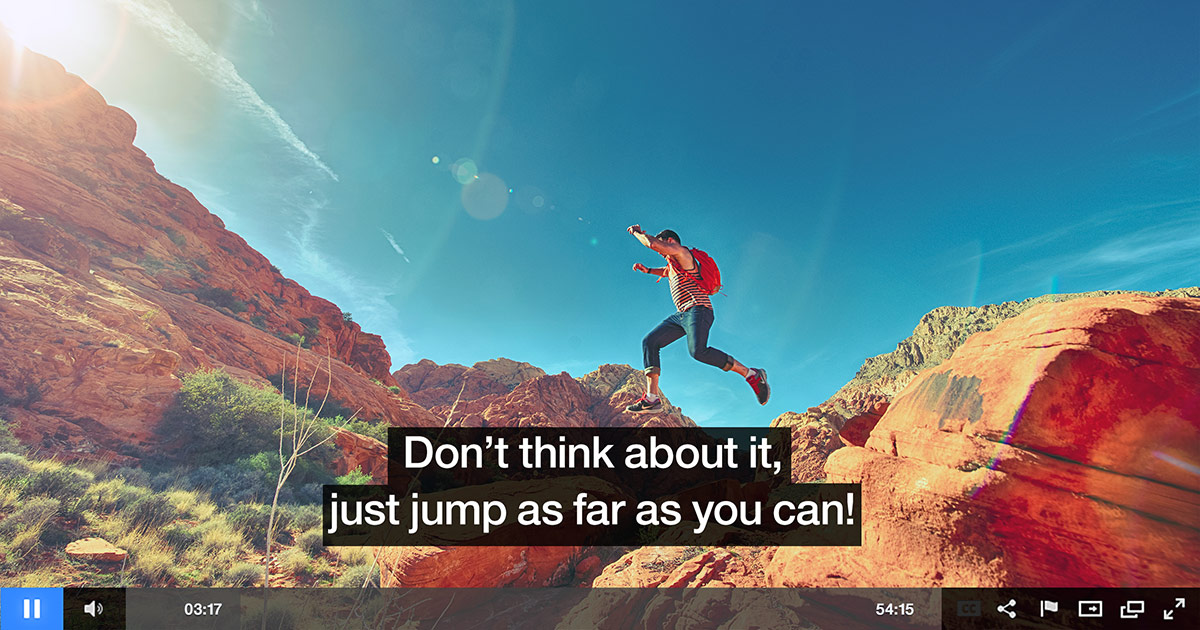
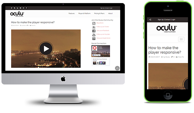
Now your video player is fully responsive. The video is playing in any Device now. Here is the Example:

In the responsive setting if you select “No” the video player size will remain fixed. It will not adapt the screen size accordingly. Make sure to click on the Save Changes button to save the changes.
Same procedure as above, scroll-down to insert video and get the standard embed code, copy the load script, insert it into your web page.
Here is the example of non-responsive video player after selecting “No”
“When you embed a video player in a page, you will notice that it does not resize with the browser window. This occurs because, by default, the video player is given a fixed width and height, preventing it from responding to changes in the browser. One aspect of responsive web design is ensuring that elements within your page adapt automatically to different screen sizes.”
If you have any questions or ways to improve this tutorial, please contact us at support@oculu.com
![Marketing Under the Influence[r]](https://oculu.com/wp-content/uploads/2022/04/marketing-under-influencer.png)